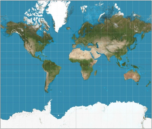
Did you know that the map you’ve been looking at for years is wrong? Now Boston Public Schools are planning to replace it with another map that is also wrong, but in a different way. For the last 500 years, we’ve been looking at maps that are based on the Mercator projection. the problem with this map is that it distorts the shape and placement of some parts of the world. For example, it shows North America as bigger than South America and Africa, despite the fact that the opposite is true. The map also places Europe at the center of the world, something that makes complete sense for a map that was designed 500 years ago, but that some scholars say taints (along with the above mentioned size issues) the way children grow up viewing the world.
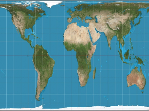
So what’s the solution? According to The Boston Public School system it is another map, the Gall-Peters projection. On this map, every country is the absolute right size. The only problem here is that no countries are the right shape. It looks like a map that’s either gone through Weightwatchers or that needs to have
the vertical hold adjusted. The main reason for this is that, despite what Shaq seems to think, the Earth is a 3D object, and images laid over a 3D object can get distorted when transferred to 2D.
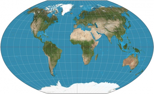
For their part, National Geographic, a group who knows a little something about maps, thinks everyone is an idiot. In 1998, they adopted the Winkel tripel projection as their official map because it solves the size problems of the Mercator and the distortion issues of the Gall-Peters.
From an educational standpoint, I’m not sure why the Boston Schools didn’t just adopt the map that National Geographic endorses. It’s kind of like asking someone other than Roget for helping finding a synonym.
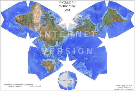
Personally, I say it’s time we get weird and adopt the Watterman projection. It shows how the Earth would look if it were unfolded from a truncated octahedron. And, it looks like a freakin butterfly!


